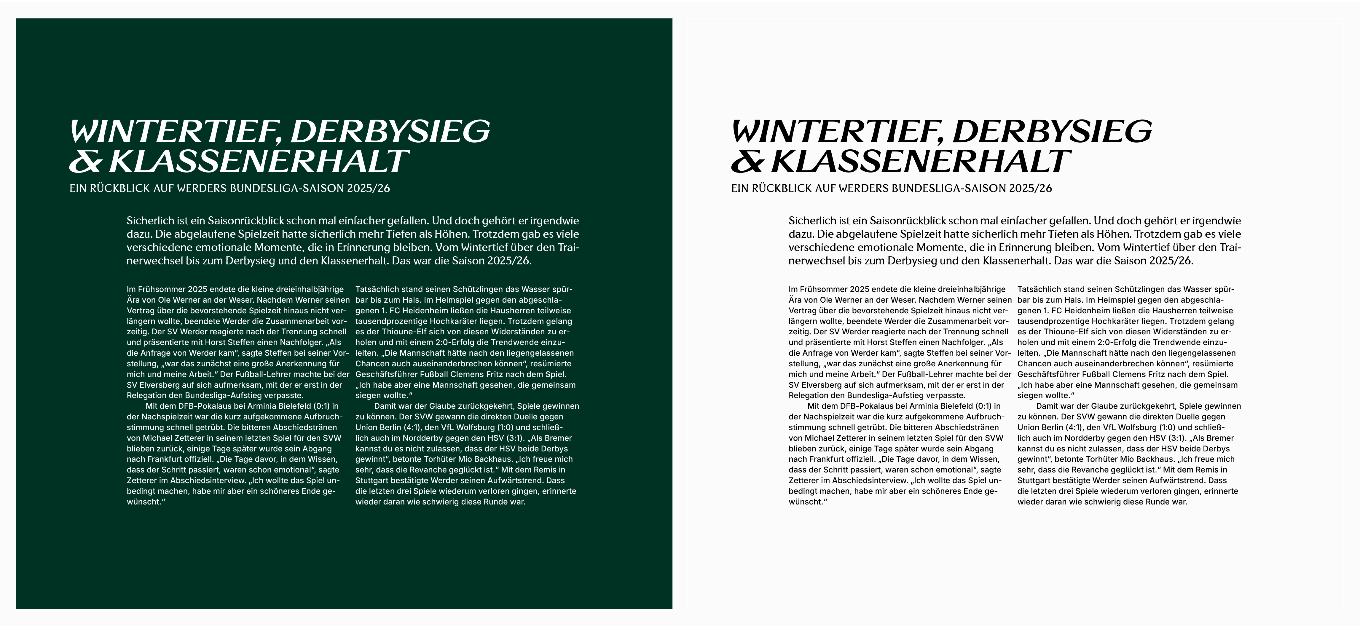
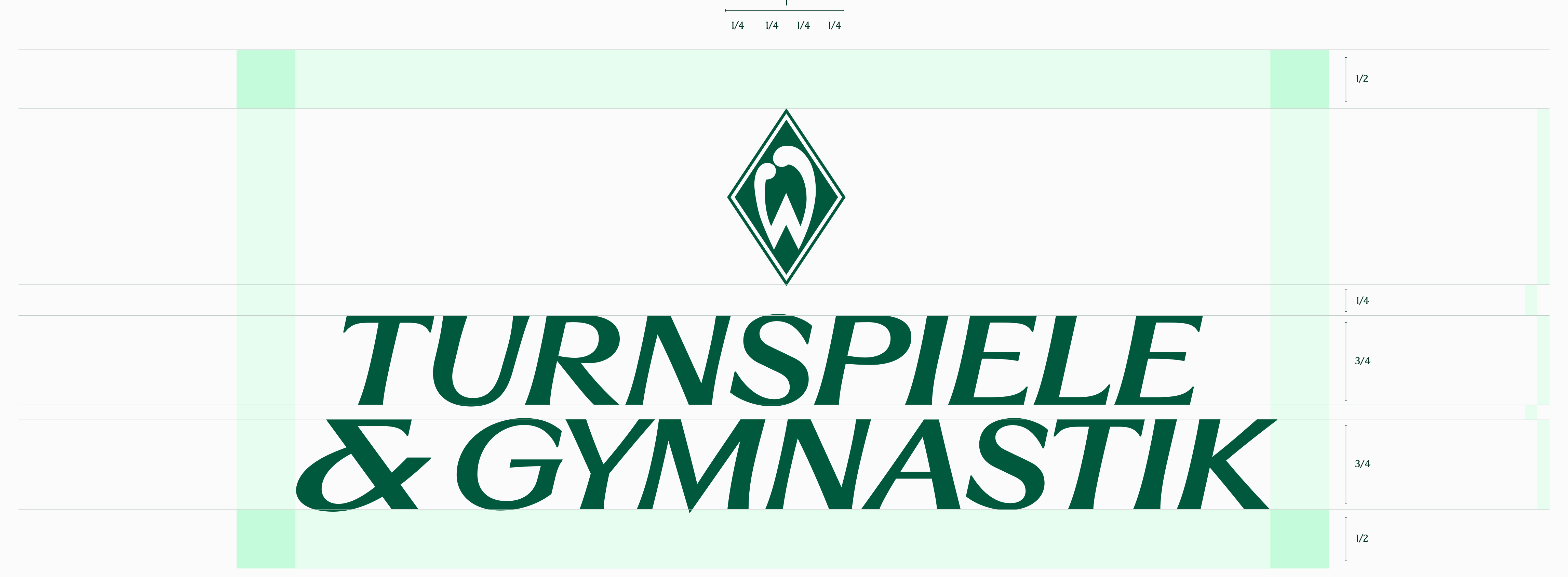
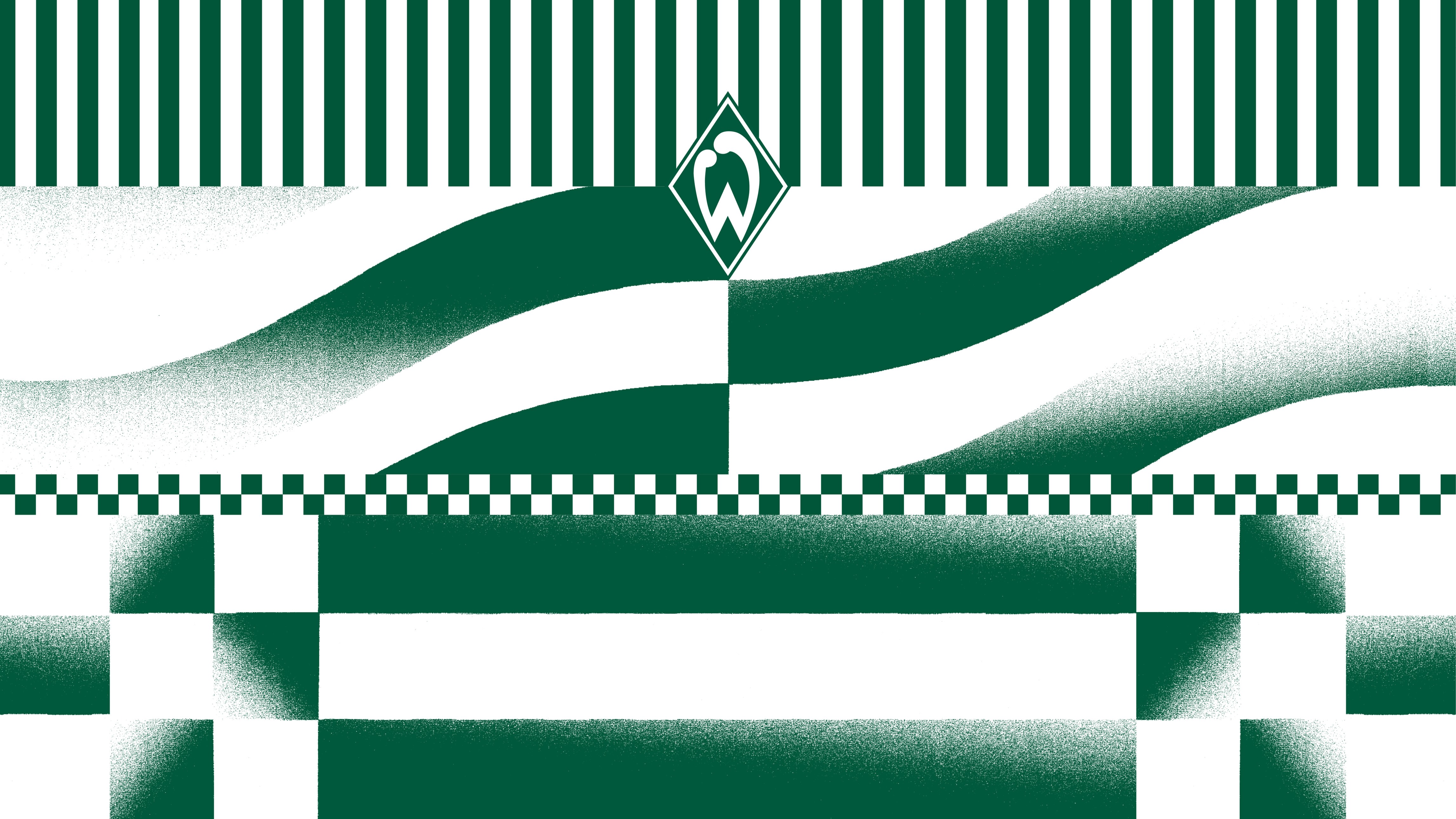
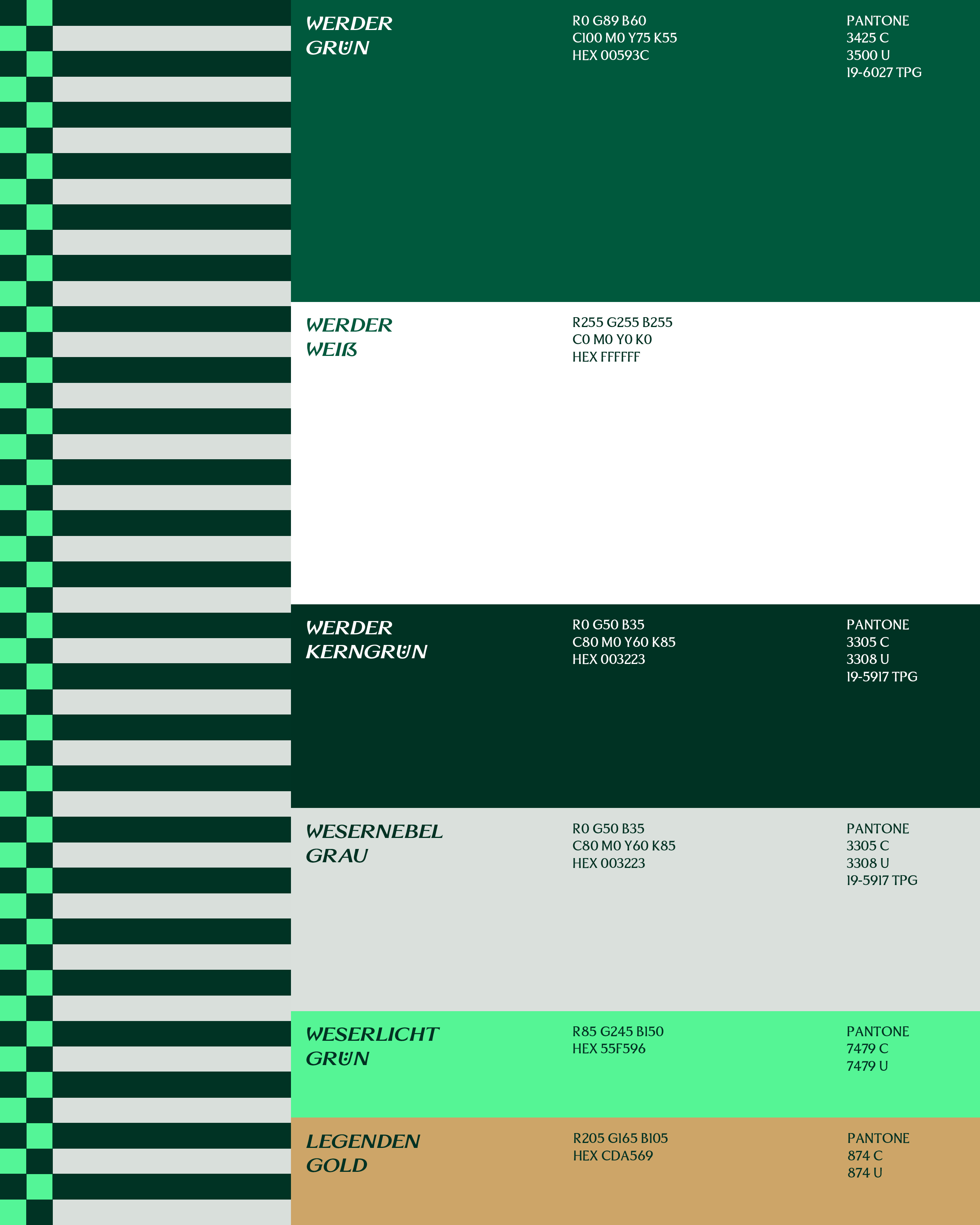
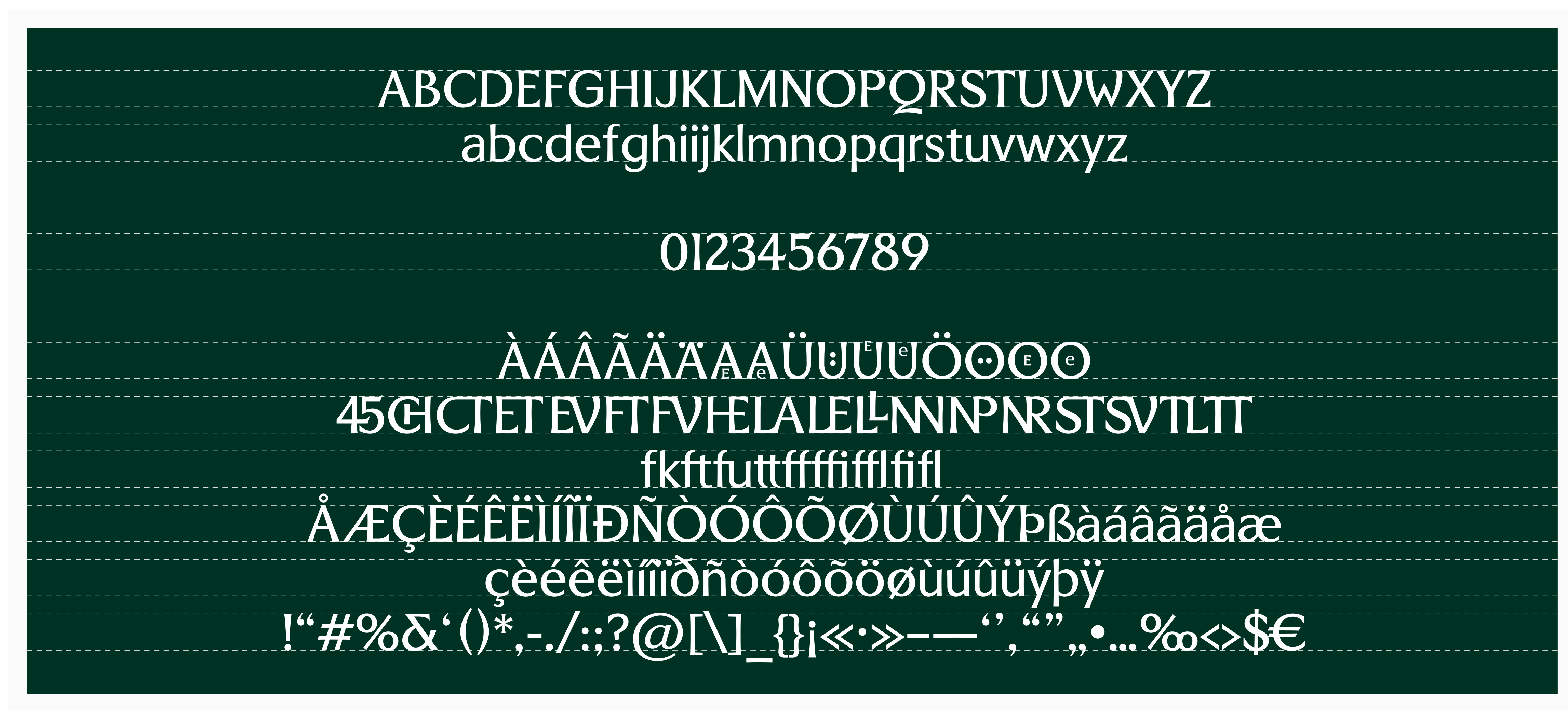
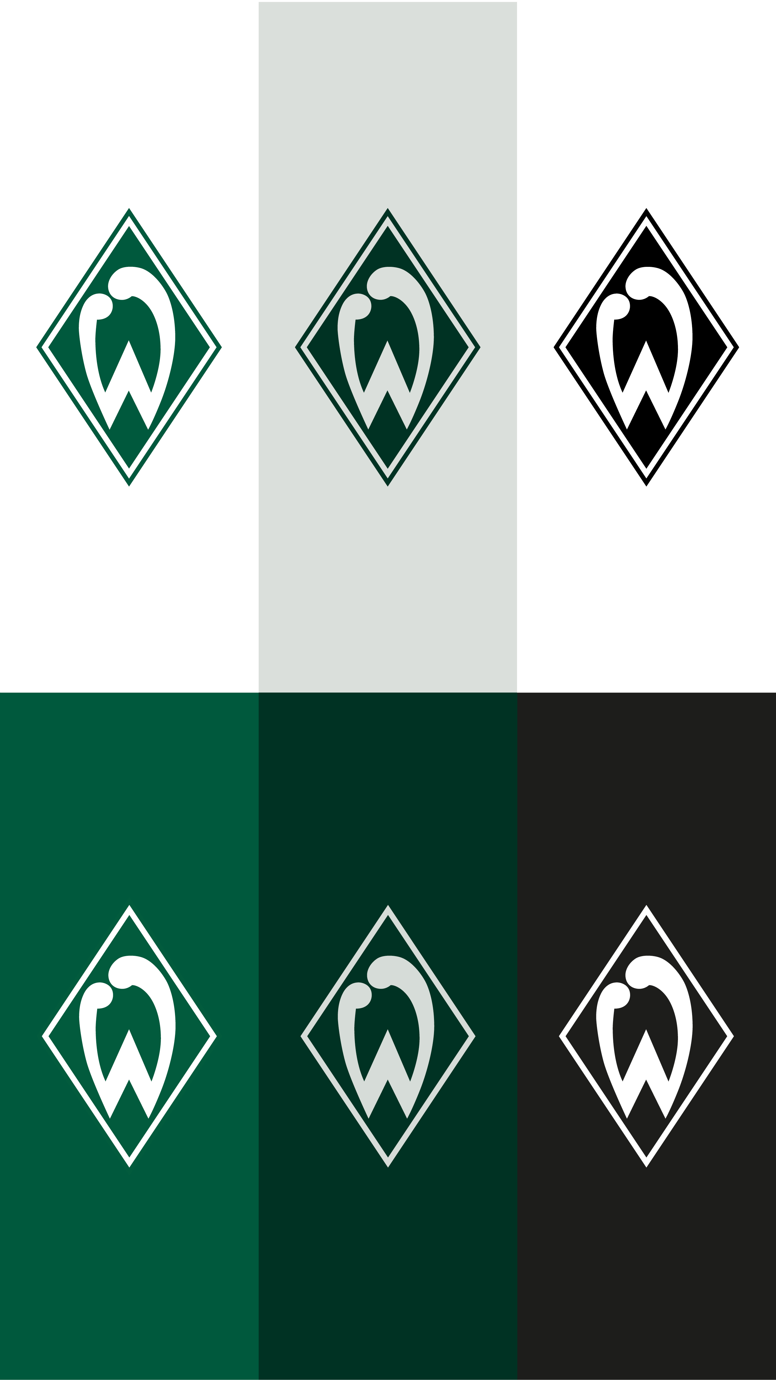
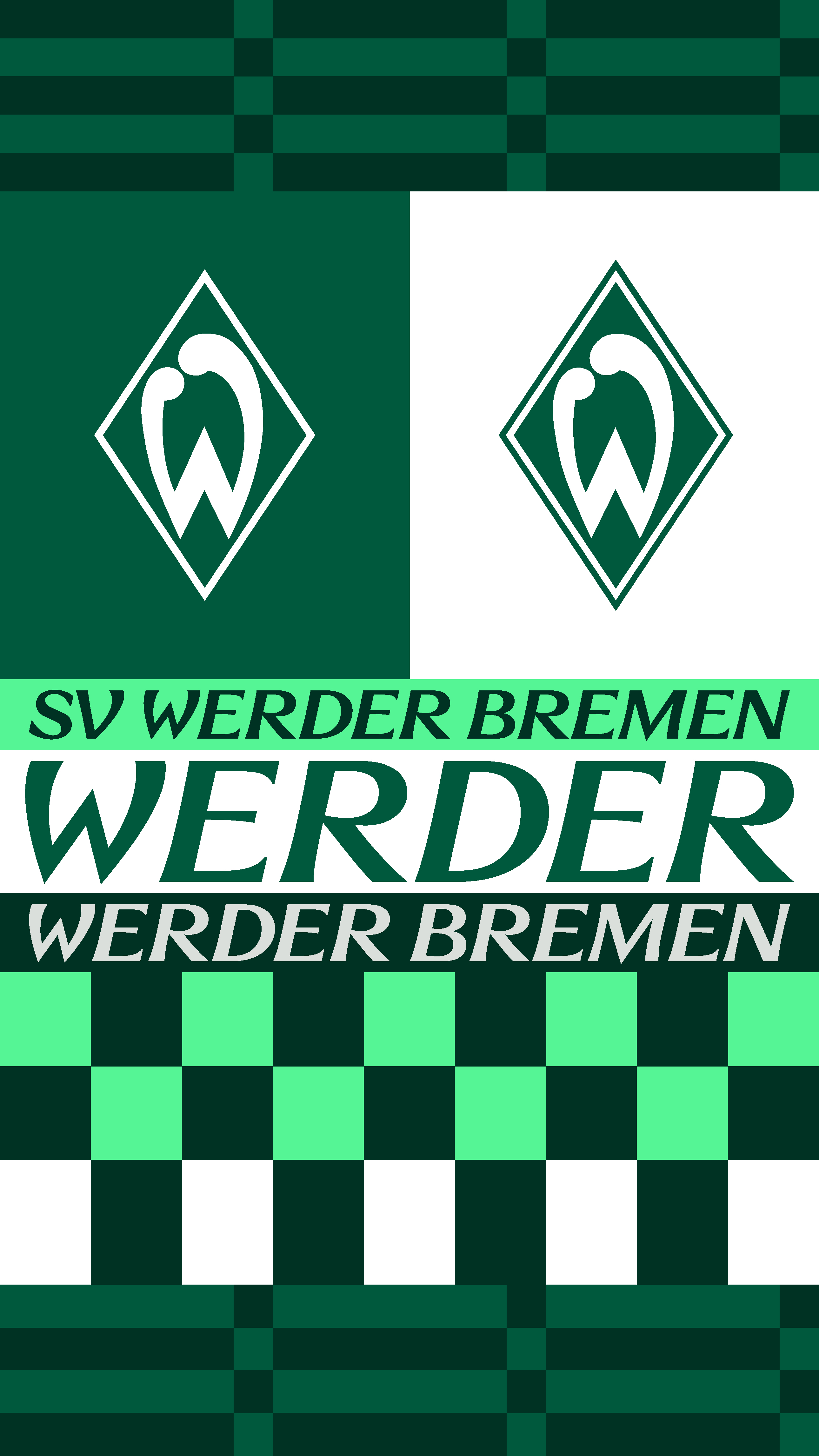
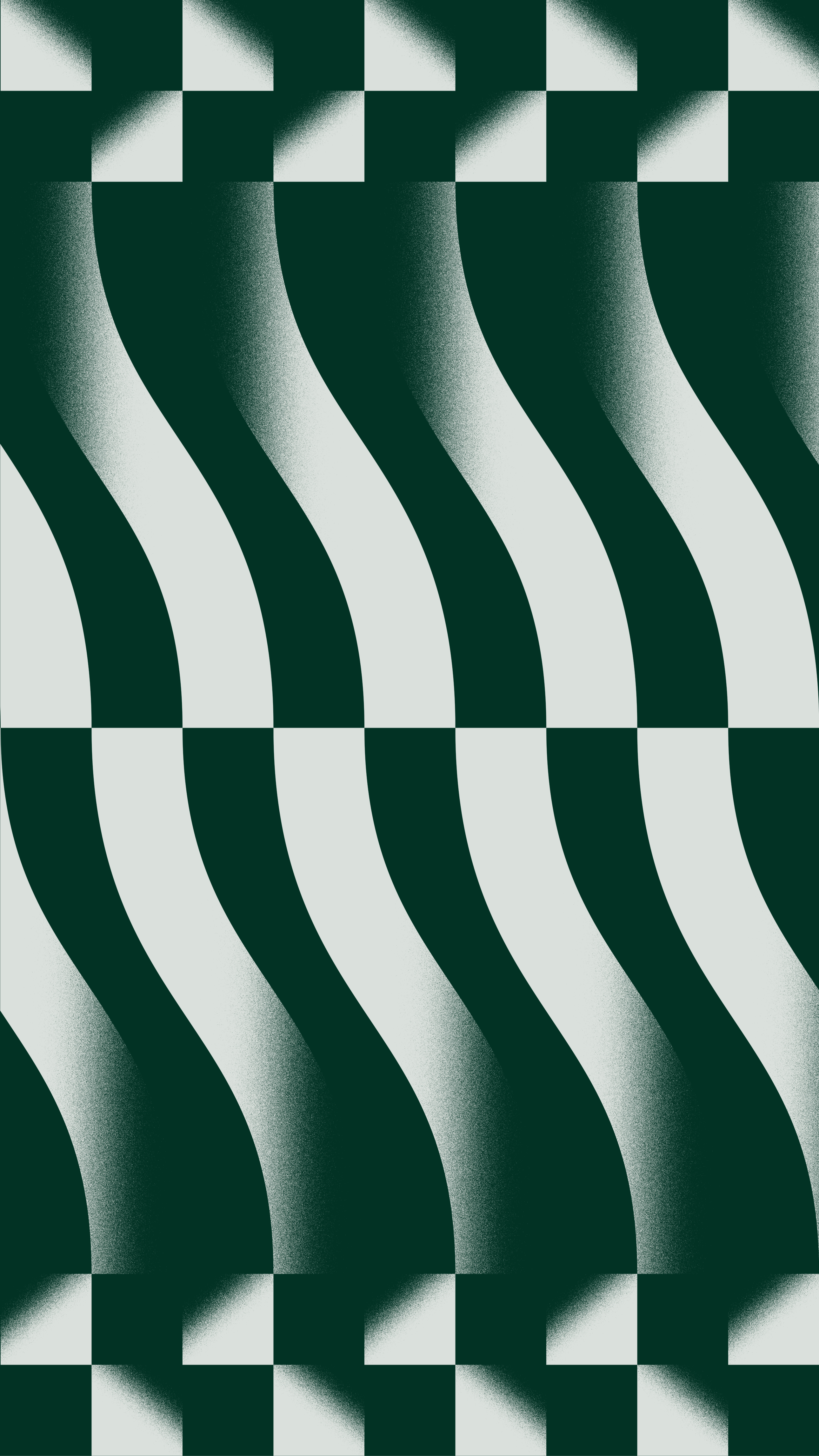
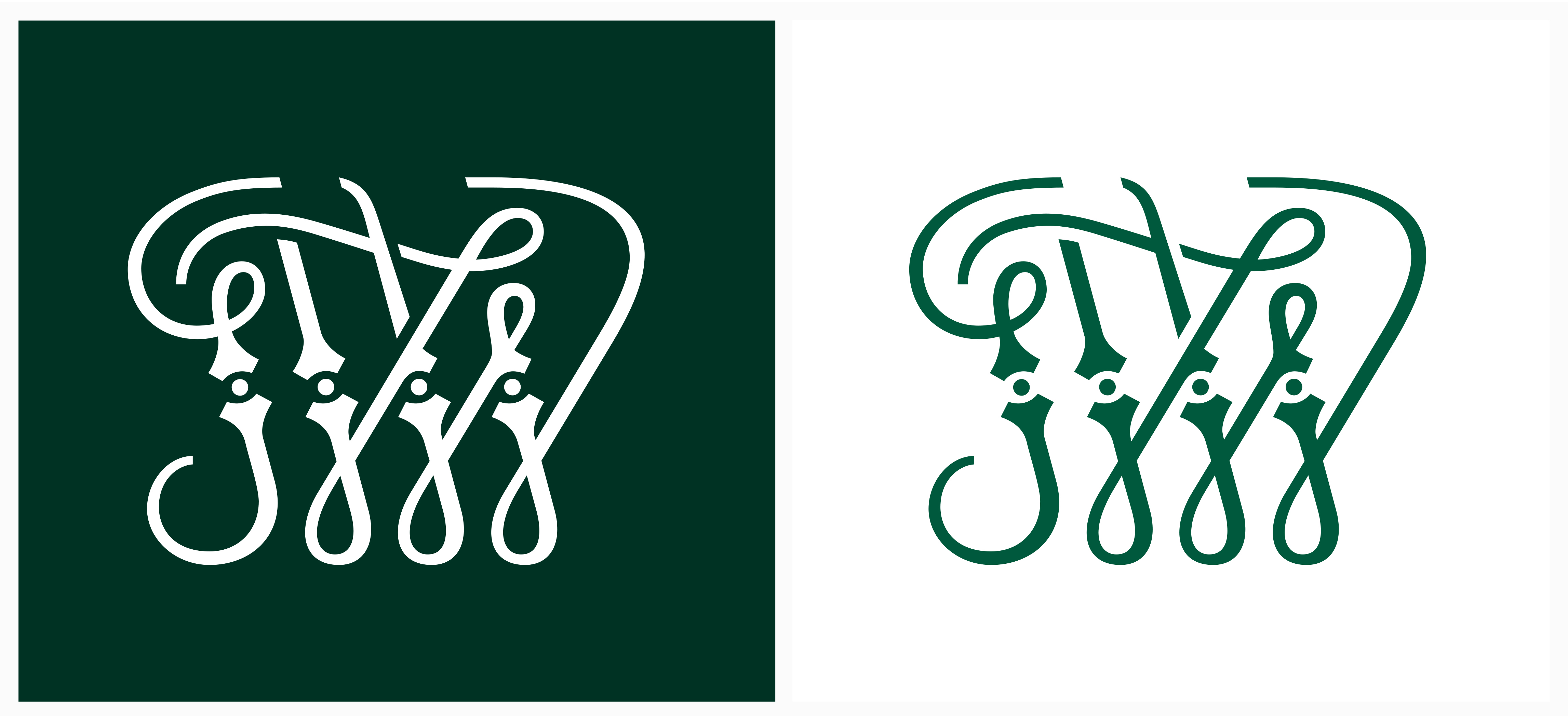
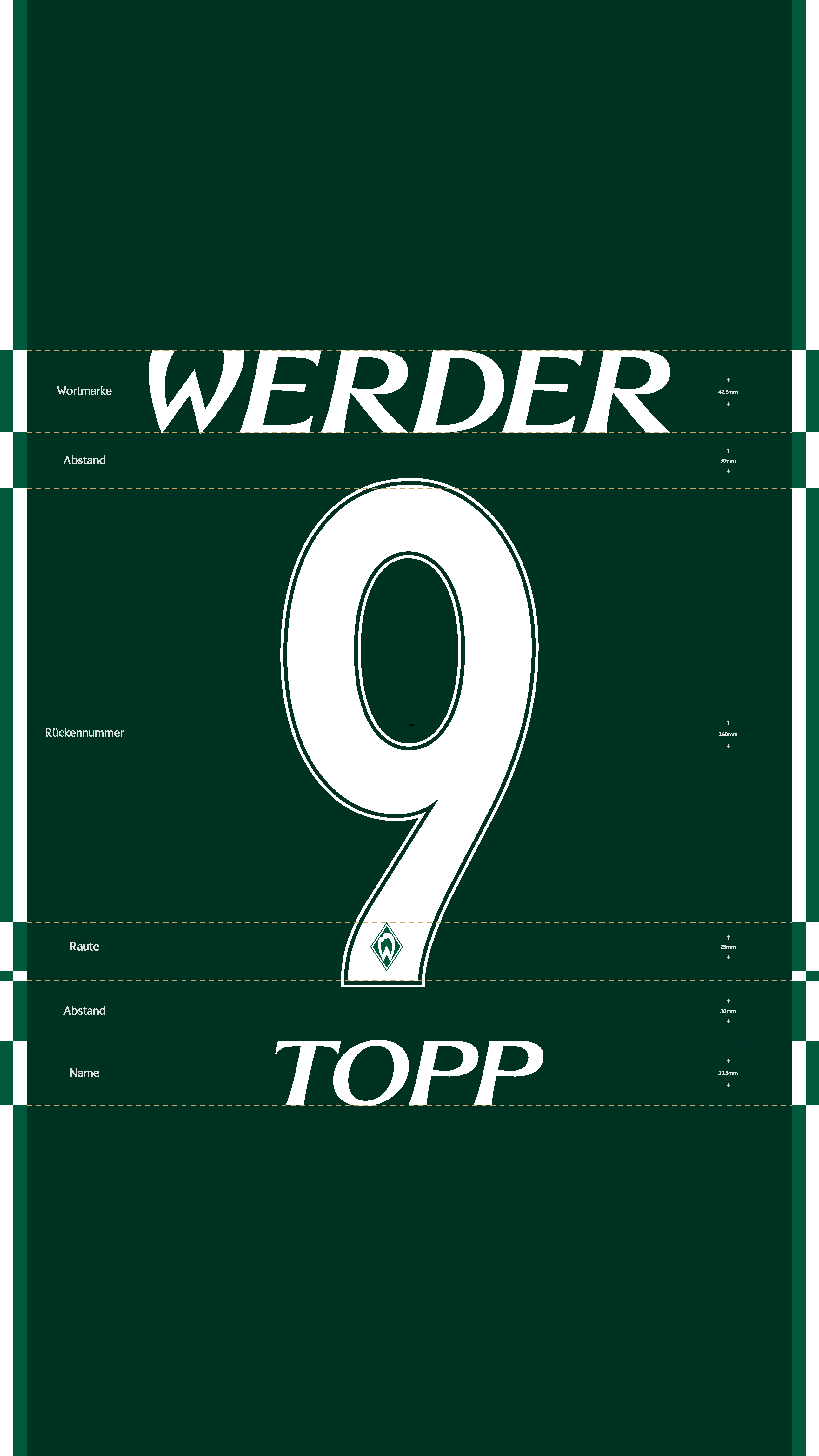
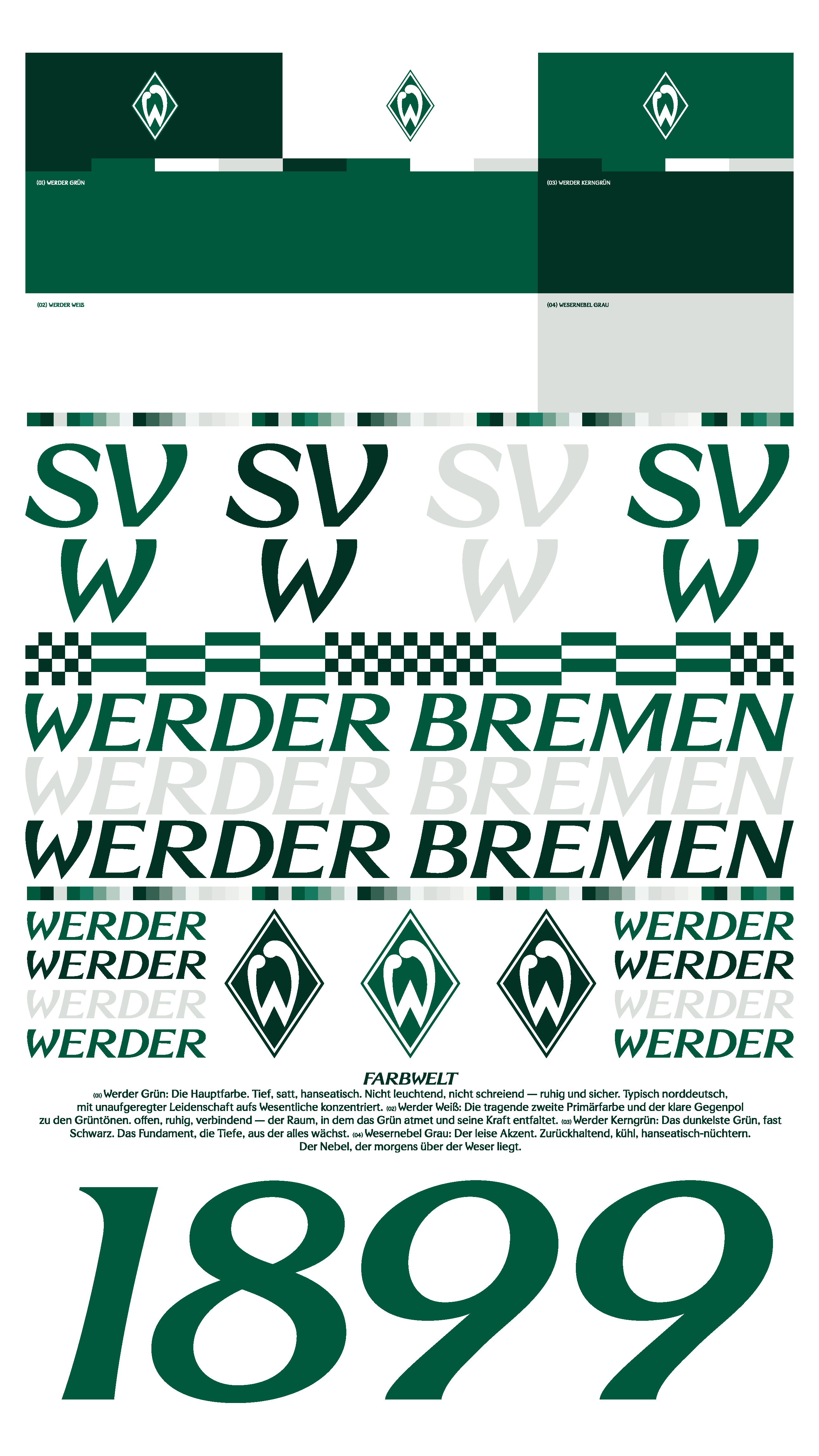
The iconic diamond remains untouched. Rather than being redesigned, its clarity, geometry, and timeless character became the foundation for the entire visual system. At its centre is “Bruckmeyer Neue,” a custom typeface developed exclusively for the club. It is named after Günther Bruckmeyer, the graphic artist who designed Werder’s first “W” in 1924, the visual origin of today’s diamond. Inspired by the geometry of this historic symbol, the typeface carries the club’s heritage into a contemporary and distinctive visual language. Werder Green was refined into a richer, calmer, and more distinctly Hanseatic tone. The wider colour palette was expanded and systematised with shades rooted in Bremen and the river Weser, each created to serve a clear purpose within the identity.Together, the typography, colours, and graphic principles form a coherent and flexible system across every touchpoint, from the Weserstadion and digital platforms to merchandise and the team’s shirts. The result is not a new beginning, but a consistent evolution of what has always defined Werder Bremen: a visual identity rooted in history and designed for what comes next.
Lebenslang Grün-Weiß. Gestern, heute, morgen, immer.
.jpg)
.jpeg)
.jpg)
.jpeg)
.jpg)